We will start with the fundamentals of technical analysis and then progress step by step to the advanced concepts so that, at the end of this book, we will be able to interpret and trade with any kind of chart.
Even those who have prior experience in trading should not skip the following section. It contains a different approach that is not often addressed in conventional technical analysis and it is a prerequisite for a successful price analysis.
Line charts
For most people, line charts usually provide the first impression of the world of financial markets because we see them frequently when we open the newspaper or turn on the television.
A line chart can describe the price development of a stock, a currency pair, a cryptocurrency, a commodity and any other financial value. The advantage of a line chart is that the information is highly compressed. One glance at the line chart tells you all that you want to know for a first elementary analysis.
If we see a rising line chart, it indicates a rally or a bull market (a bull thrusts its horns in the air). If the line chart shows a falling price, it indicates a bear market (the bear swipes his paws down).
The closing prices for a day are usually plotted and joined together in a line chart. Every day, we move one time unit to the right on the scale. This kind of chart is also called a daily chart.
The disadvantage of a line chart is that the price fluctuations within a day – or any chosen time period - cannot be recorded since the line chart shows only the closing prices. However, we all know that there can be strong price fluctuations in the financial markets and neglecting them can be a disadvantage for the precise technical analysis.
Candlestick charts
Candlestick charts are further developed line charts that serve to compensate for the disadvantage of less information. Candlestick charts have their origin in 17th century Japan. Today, candlestick charts are the preferred tool of analysis for traders and most investors since they provide all the required information at a glance.
The candlestick
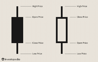
As the name suggests, a candlestick chart is made up of so-called (price) candlesticks. These candlesticks are made up of different components to describe the price movements of financial instruments.
Two sample candlesticks are shown in figure candlestick consists of a solid part, the body, and two thinner lines which are called candle wicks or candlestick shadows.
The candlesticks are color-coded to illustrate the direction of the price movements. A white candlestick represents rising prices, whereas a black candlestick shows that the price fell during the period.


Comments
Post a Comment
thank you for visiting :)